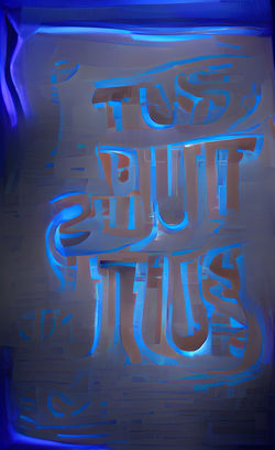
I want to do a text visibility experiment - as my publication is getting darker in colour I need to ensure legibility.
The brief states that only your chosen colour and black can be used. So instead of making the text white in the next spreads, I will make it a lighter blue
text
text
text
text
text
text
text
text
text
I tested an electric blue and a paler blue
-then also a black to see if I could still possibly use it in this spread? ( you can't )
- I prefer the electric blue as it reinforces the chosen colour blue more than the paler as this looks more on the side of white
- it is bolder and links nicely to the colours and visuals of the ' blue light district ' in the previous spread
-
text
text
text
text
text
text
text
text
text


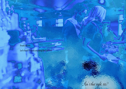
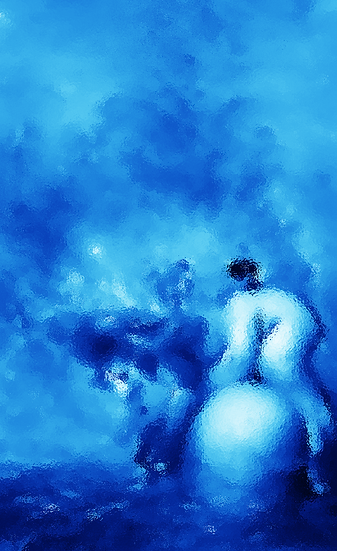
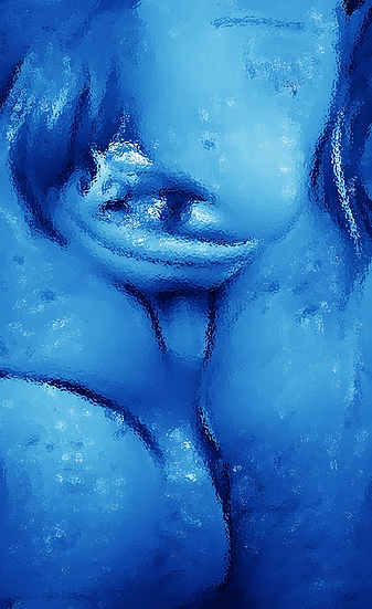
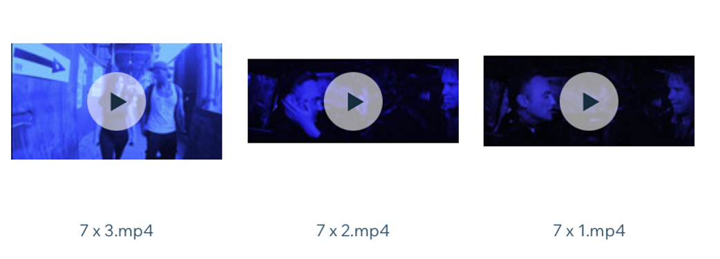
I decided to add filters on photoshop . To make the AI imagery feel more suffocated and distorted as this what the depths of negative sexualisation feels like
the filter I'm going to use for this spread is glass, as these pages surround the horror of objectifying and sexualising women - as ' just objects to fuck '
- this is something that is far too common and I want the reader to feel like , similar to how it usually happens, is looking in from behind closed doors


 |  |
|---|---|
 |  |
 |  |
key words : blue fuck tits arse no consent


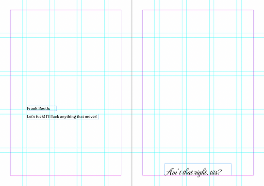


I changed the colour of the text to a bright blue and it wasn't clearer as I predicted. I think these blues are too light still in the background visuals. The next double page spreads I think will need to the change in text colour, but not this one


haven't decided on these yet