


colour plan - Azure Blue
The papers and colours I could use
in my publication

colour plan - Adriatic

after attending the talk with this company at uni, and conducting research, I would love to utilise them within my publication. This would really enhance the user experience and hopefully help to tell the story I am trying to portray
colour plan - Colbolt

colour plan - Cool Blue

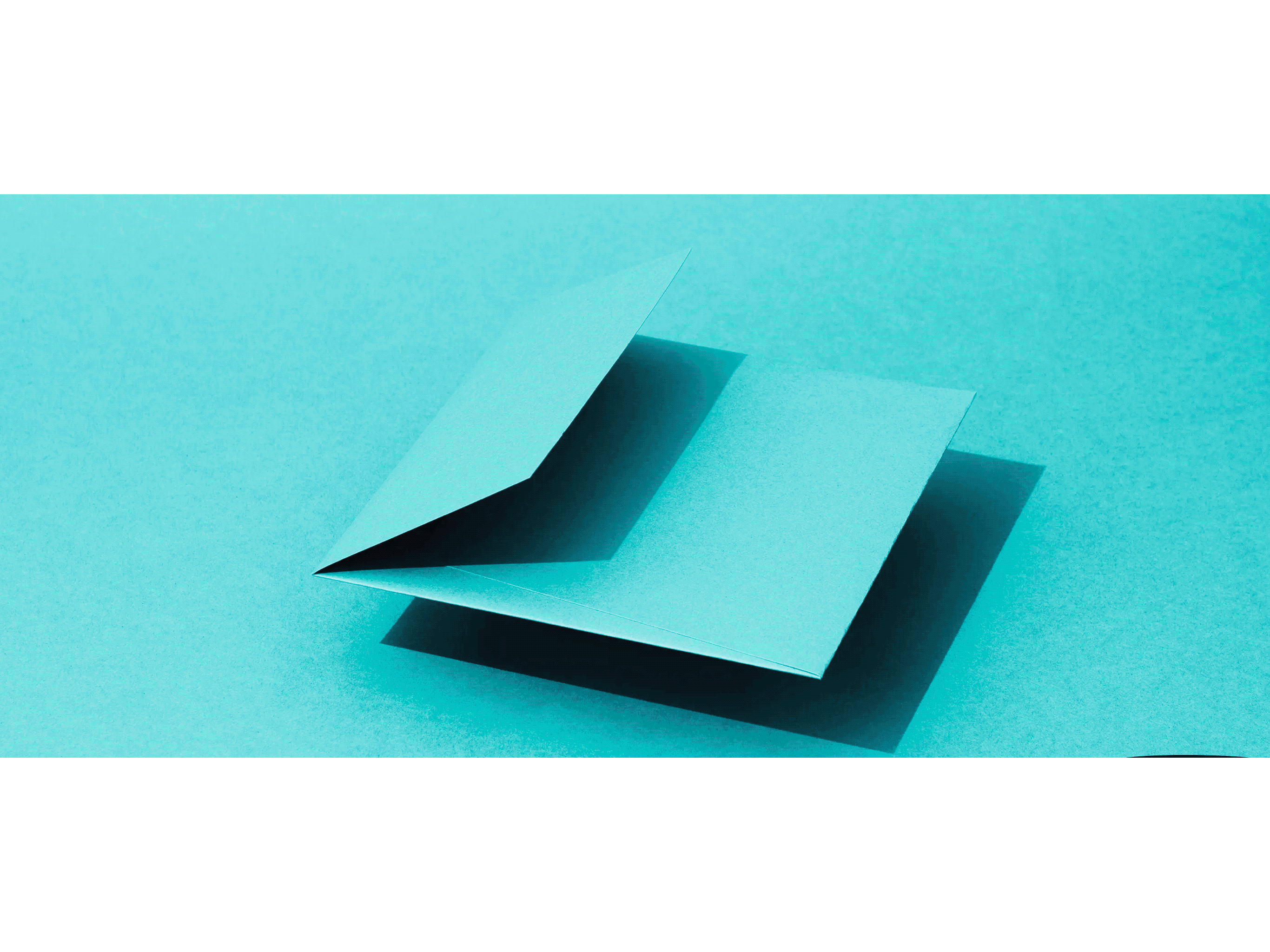
colour plan - New Blue

colour plan - Royal Blue

colour plan - Tabriz Blue

colour plan - Turquoise

I could request up to 15 samples of A4 and then only need to pay for 5 more sheets. However this is only offered in colour plan. To use any specialist paper, you are only warranted 5 samples.
For making a book binded publication with velvet as the cover, the pages within need to have some thickness so It doesn't feel like a zine with a velvet cover just placed on with s flimsy inside
However I don't think the colour plan is worth my while as I can get very similar stock from the AV store. It does present more colours of blue however


I prefer the smoother finish
- from the prototypes I received

From looking into prototypes and examples of digital printing onto these paper stocks, I prefer the look of the prints and colours of ink on white paper, not the coloured blue colour plan above. Because I am going to present the colour changing from lighter to darker blue through my imagery, I don't need paper to do this. Plus the prints come out more vibrant, especially when using specialist paper.

smoother Munken Design - way prefer the printing vibrancy and feel on this paper - but could always start smoother and then get rougher - maybe this could be a loop hole in the samples pricing


Only one colour to choose from, some less range and all same texture


I really like the feel and vibrancy of images on this paper, a lot more than the last.


- the red is vibrant


This is one of the softer examples of there paper.
I love the texture, which automatically enhances the quality appearance.


This is the the softest feeling paper stock I felt whilst exploring the prototypes. This is the only truly pure white coated papers in the world according to their website. It is the perfect paper for printing the deepest blacks. This feels the most luxurious paper. Good for the darker spreads at the end of the publication .


This is going the wrong way and throwing in a rougher feeling paper stock, but this could be an interesting paper for the end of the publication spreads - linking back to blue velvets opening scene panning from the American dream neighbourhood to the dirt and beetles that lay beneath the surface. Start with a smoother texture and lighter blue hues and then travel the rougher stock and darker colours.


I picked up samples, but due to the £5 minimum order fee I choose some extra experimental papers, which came to a total of 25 different papers by the end. All A4 as I want to make an A5 publication at the end


Studio Sly - WMC publication
" The brand design is bold and electric in both its visuals and typographic style. With an array of photography, illustration and varied mix of typefaces. This is the first inspiration I came across within the research stage of this project and really framed the direction of my project. I originally wanted to focus on the richness of red and the depth of the colour through the velvet, but as all good projects go my research led me towards a blue colour palette
Brand design and publication @studio_sly
Book interior photography @samwongphoto_ styled by @natturnbull
Illustration by @xx_in
Production @whiteslaw


I love the art direction - staying in the same colour palette - makes it feel dramatic.


I could experiment with placing typically " sexual " objects within the art direction - to try compositions

Good photography set up for my profolio photographs. However I learn from my lecture give insight into the scale of the publication, photograph whilst holding the book ( but with clean hands,

Very similarly to my publication concept :
"Every week has a song matched, graphically represented by its sound waves. The agenda’s title, “White Rabbit”, is inspired by a notorious song written by Jefferson Airplane, one of the pioneering bands of psychedelic rock. The same song has inspired the whole color palette and the agenda's mood."
- Chiara Barberi

I really enjoy the binding. However,
this I don't think will be a way I bind my
publication together, as I think my binding will be covered by the velvet cover and back


very interesting and different photograph used
within the art direction. Very close and intimate
- could be a good way to represent the intimacy
of sex however but would have to use a different
material for the cover