

The secret to any good design lies in the way its visual elements are organized and positioned in relation to each other. This is exactly what layout design is all about.
It helps maintain balance from page to page or slide to slide.
An important component of layout design are grids. Grids are the backbone of all layouts, infographics and presentations. When you are designing on an online editor you are using grids without even knowing it.

The format is the full area where the final design will be laid out. In print design, the format is the page and in web design the format is the browser window.


Margins are the empty spaces between the edges of the format and the content. The size of the margins is what gives the content a general shape, usually a rectangle.


Flowlines are horizontal lines that separate the different sections of a grid into parallel bands. They help the reader follow the content of the layout. Flowlines also create stopping points, or edges for the elements to be placed on. Some flowlines are called hang lines and others are called baselines.

not as helpful to view but just thought
looked really funky ! :)


Modules are the building blocks of any grid. They are the spaces created between the flowlines and vertical lines. Vertical groups of modules together create columns. Horizontal groups create rows.


Groups of adjacent modules in vertical and horizontal areas create spatial zones or regions. A vertical region can hold a block of text, a horizontal region can hold a video. Regions can be organized proportionally or used to create overlapping zones.


Columns are vertical spatial zones or regions that fit fully from the top to the bottom margin.


Rows are horizontal spatial zones that fit fully from the left to right margin.


The spaces between rows and columns are called gutters. These should always be equal between columns or rows, in order to maintain a visual balance.


Markers are areas inside the running header or footer that mark the exact place where repeating information is placed from page to page.


Column grids are used to organize elements into columns. Magazines use column grids to place the text in easy-to-read sections. Some academic textbooks also use them. Column grids are used inside websites as well, like in online newspapers or blogs.
Text and images in a column grid are placed following the vertical lines and flowlines that make up the columns. Images can be placed inside one column, or across two or more to create a different visual layout. The spacing between columns (gutters) should be proportional and consistent throughout the entire document.


A modular grid is similar to a column grid in that it has columns, but it also has rows. This kind of grid is used when there are more elements to organize and a column grid isn’t enough. Newspapers use column and modular grids to organize the stories comfortably and easy to read. Modular grids have equal size modules. This makes it easier to “break the rules” and use the spatial zones in different ways.
A baseline is the line where text sits. Leading is the spacing between baselines. A baseline grid can be applied to any of the grids mentioned above. Using a baseline grid will give a flowing rhythm to the text. It will also give the headings and subheadings a proportional space in relation to the body text, making them more pleasing to the reader.


This is a composition grid that separates any space into a grid of nine equal spaces. This grid system can be vertical or horizontal but all the nine spaces always have to be the exact same size. The elements in the design are positioned in two ways. Focus points are placed according to where the lines cross from top left, top right, bottom left and then bottom right. Other important elements, usually body text, is placed inside the spaces created by the intersecting lines.
The Rule of Thirds is believed to create a pleasing composition for the viewer. By following the Rule of Thirds grid, you are making sure that your design is balanced and proportional. It is used in graphic design and also in photography.


The Golden Ratio is also called the Golden Spiral or Golden Mean. It is a phenomenon of composition found in nature that is also applied to design. Many famous logos were created using the Golden Ratio and it is very commonly used in photography as well.
The Golden Ratio is closely related to the Fibonacci sequence. This mathematical equation rules the measurement of the Golden Rectangle, a shape that is perfectly balanced. Using the Golden Ratio or a group of Golden Rectangles in your designs will follow the ancient composition of nature.


When designers use grids they do not always stick to the basics. Mixing grids is a common way of making layout design more creative and appealing. A multi page document will follow the same measurements of the manuscript grid but will have different grids for different parts of the formats.
Take a look at what a magazine layout looks like when the pages are opened and set up side by side. Notice the spaces that maintain the same proportion from page to page and the others that are different on every page. Using composite grids in a creative way will make your designs more pleasant.


Designs with lots of abstract color and shape compositions do better with the rule of thirds or golden mean.


From the link of blue velvet by David Lynch, as an ongoing
inspiration for my publication. I want to emboss the velvet
with the title " Blue is the new sex hue " similar to the example
below
Its interesting how any existing examples of this texture for a book
is wedding / ceremony related ( follow the link to a website that
fully creates velvet publication products ). This is I am guessing
to represent luxury and uniqueness surrounding your wedding
day as this is such a special moment in your lifetime.


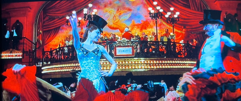
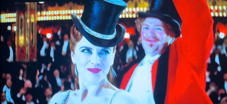
Velvet is used within more prevocative movies such as Chicago and Moulan rouge, wether that is within the costume design which is a common material for burlesque outfits historically, velvet beds hinting at seduction, lingerie and most commonly known the red evilest curtains. Moulin Rouge ( 2001 ) opens and closes with this velvet curtain. Interesting the well known saying " a peak behind the velvet curtain " meaning looking behind the seams, beneath the surface, in concealment; in secret. It is an idiom made up of " peak behind the curtain " and "look behind the velvet rope " giving the illusion of value, and authority - almost like a VIP as it barricades the look of spectators so if you get to look behind you will receive the nitty gritty and secrets.
- Goo link to Blue velvet and the opening scene of panning down to the Beatles.


 |  |  |  |
|---|
shopify.com
-
Breaking the grid can add extra emphasis to a specific element. It’s one of those design rules that when sparingly broken can enhance the meaning of a project. When breaking the grid, it’s important to follow many of the other “rules” of design.


